

First Growth Agency
First Growth Agency is one of the top options for your tailored digital marketing campaign. Our campaign can drive more traffic, leads, and paying customers to your business. Not only this, but also allows us to meet your business and marketing goals.
Visit Website
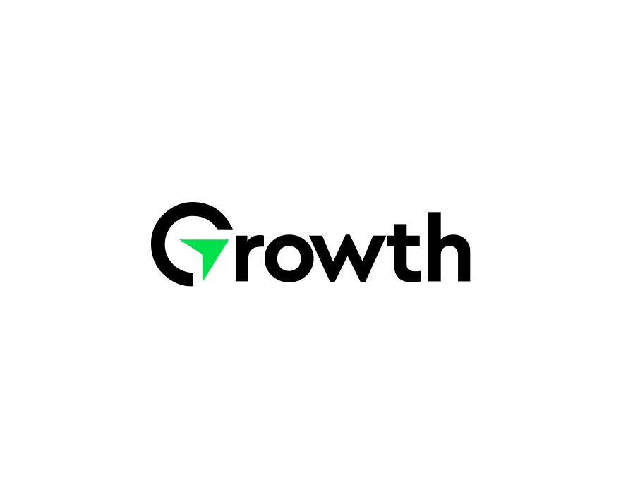
An Identity that Foster Growth
First Growth Agency was looking for a logo that holds an innovative and result-driven approach for digital marketing, aiming to create an impactful yet clean visual identity that can be used across all the branding platforms.
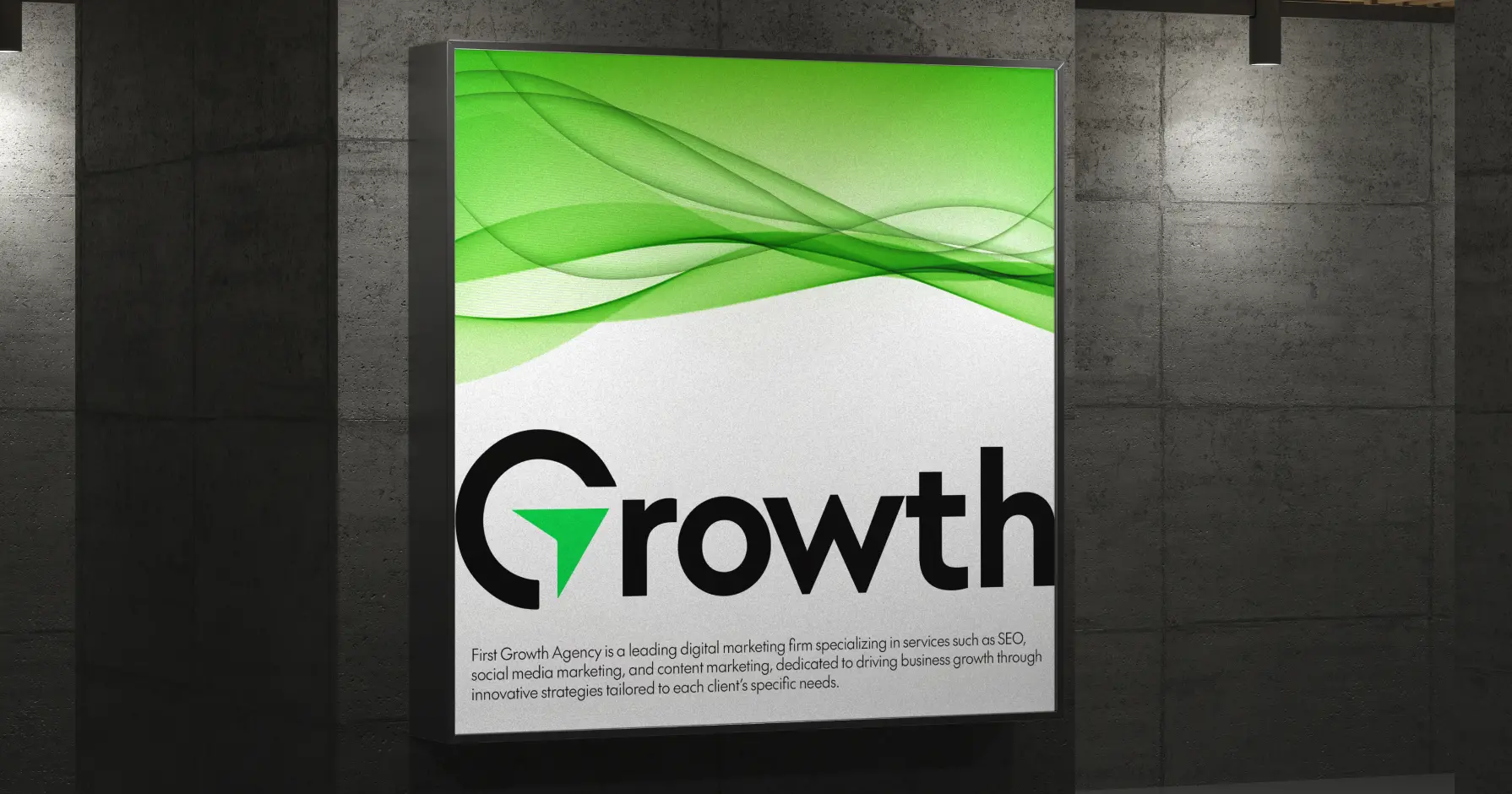
Symbolism and Concept Ideation
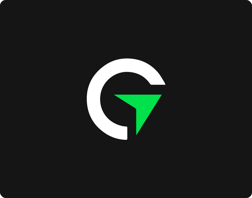
After a detailed consultation, our team of experts came up with the concept of continuous progress and strategic direction. The "G" in Growth was made with a unique arrow icon, presenting success and movement.
This subtle yet strong addition shows the First Growth's commitment to helping businesses to scale and evolving through careful refinement to maintain a minimalist yet striking aesthetic.
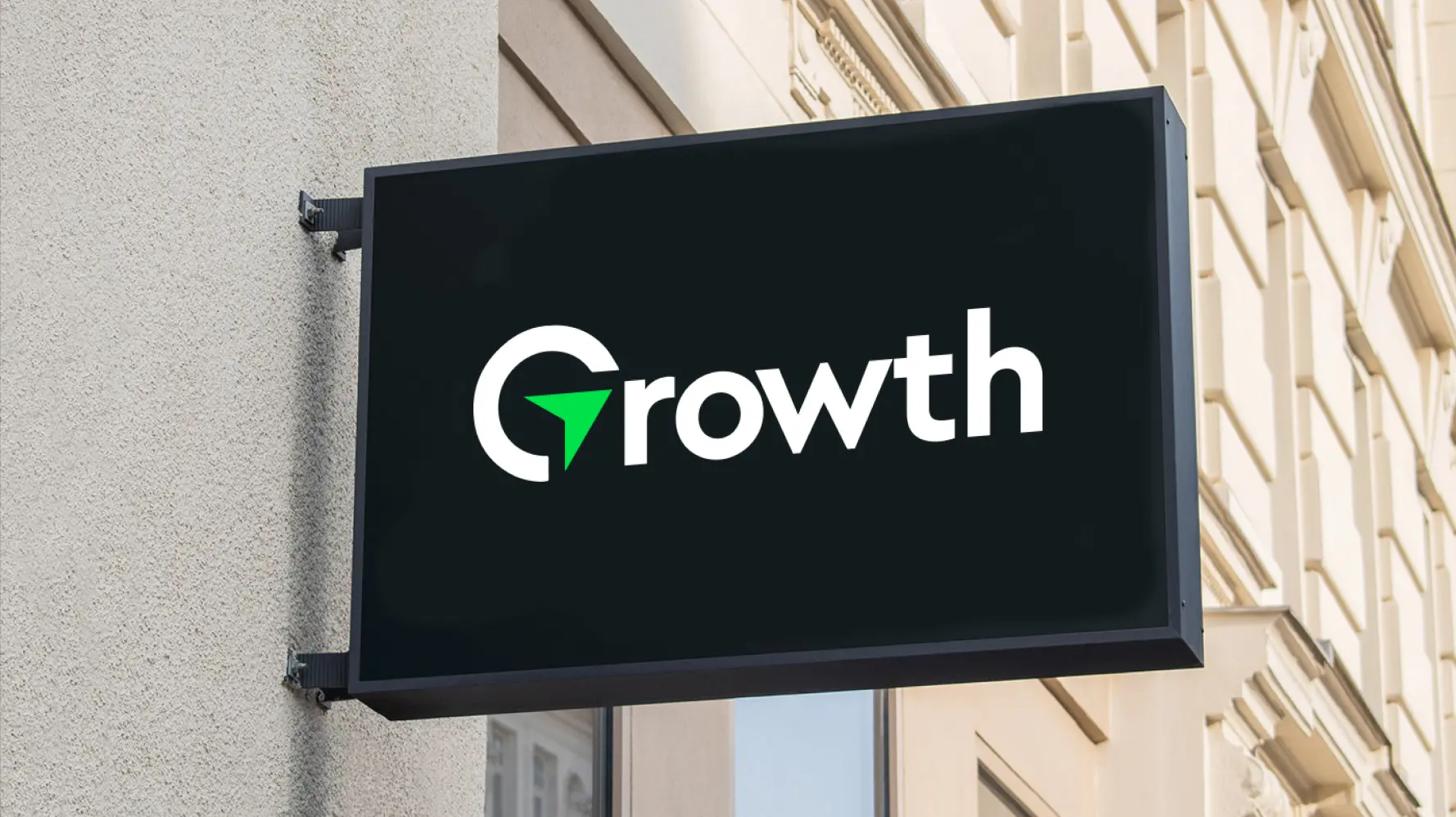
Identity with a Bold and Energetic Palette
To create a standing brand identity, our team of logo designers utilized a different strategy to meet the aesthetics and boost credibility. Our team decided to stick to "The Future" font as both primary and secondary font, creating a clean, modern appeal and ensuring clarity and professionalism across all branding materials.
For the color palette, we trusted Green (#01E14B) to present vitality, growth, and success, with a complementary shade of white (#FFFFFF), and black (#000000) enhance contrast and elegance, reinforcing a timeless and authoritative brand presence.
The Future
Aa, Bb, Cc, Dd, Ee, Ff, Gg, Hh, Ii, Jj, Kk, Ll, Mm, Nn, Oo, Pp, Qq, Rr, Ss, Tt, Uu, Vv, Ww, Xx, Yy, Zz
We were picky, and honestly, not the easiest client to please. But MeetWithZaman stuck with us, revised the logo four times, and nailed it in the end. Now our brand looks sharp and professional — and we've seen a 35% increase in client engagement on our social pages.