

Roots Heritage Realty LLC
Roots Heritage asked us to design a sophisticated and evergreen logo that clearly reflects a sense of luxury, trust, and innovative touch in their real estate. The goal was to create a strong and ideal identity to connect us with home buyers and home sellers
Maintaining Real Estate Elegance with High Standards
Roots Heritage tasked us with creating a timeless, luxurious logo that builds trust and connects with modern homebuyers .
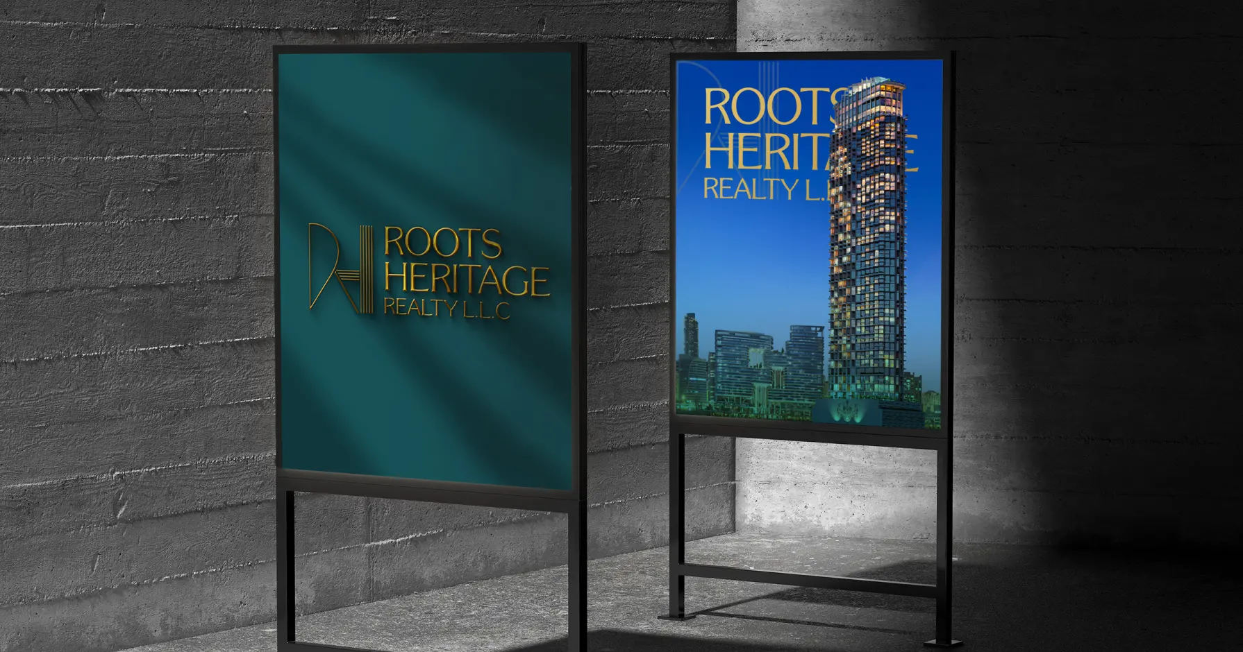
Aligning the Heritage with Innovation
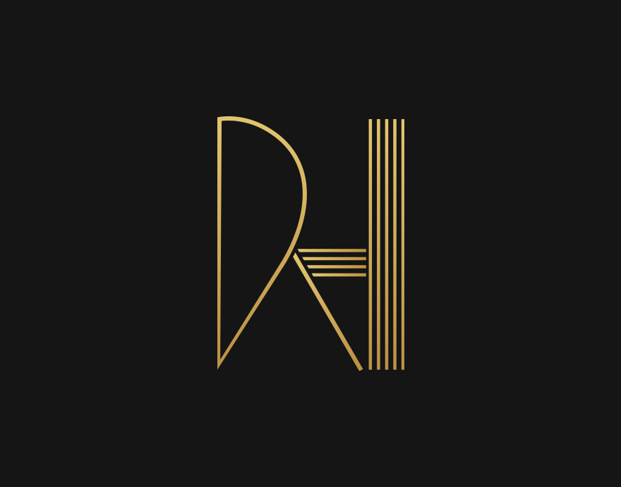
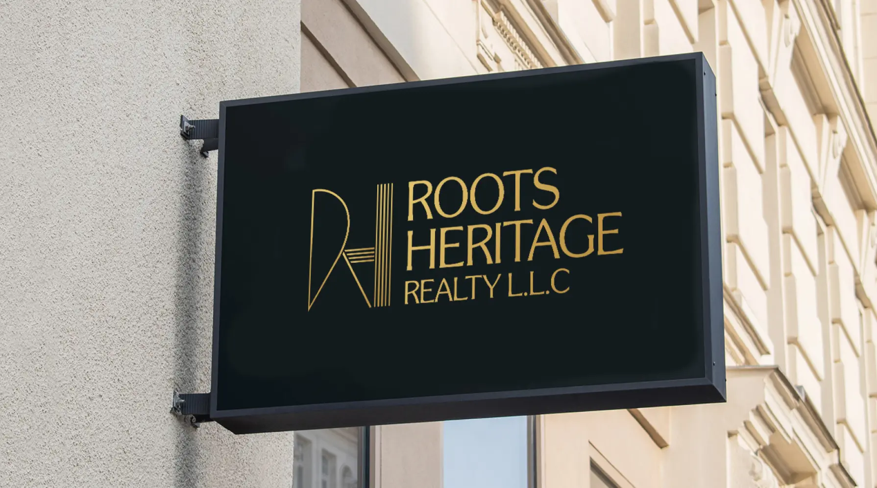
To come up with Roots Heritage’s requirement - our expert logo designers took on the charge and merged the logo concept with minimalism and architectural symbols, ending up with an elegant “RH” monogram. Clean lines and structured elements represent stability and growth, meanwhile negative spaces improve the visual appeal .
This minimalistic and attractive design holds and echoes the brand’s commitment to reliable real estate solutions, creating a refined, memorable identity that aligns with Roots Heritage’s vision .
Creating a Palette of Prestige and Trust
The Roots Heritage brand identity is strengthened through a distinguished font and color usage that exude sophistication and credibility. The primary font, Souvenir, brings a touch of elegance and heritage, while the secondary font, Poppins, adds a modern and clean aesthetic for readability and versatility .
We created a color palette that blends deep teal (#175258), symbolizing stability and growth, golden hues (#BD9346, #E1C36D), representing luxury and prosperity, charcoal gray (#424242), for depth and sophistication, and white (#FFFFFF), for balance and clarity. These elements together create a cohesive and premium visual identity .
Souvenir
Aa, Bb, Cc, Dd, Ee, Ff, Gg, Hh, Ii, Jj, Kk, Ll, Mm, Nn, Oo, Pp, Qq, Rr, Ss, Tt, Uu, Vv, Ww, Xx, Yy, Zz
Not gonna lie—we gave them a hard time. But they delivered. The logo looks professional and stands out in our industry. We've already updated all our materials, and lead conversions jumped by 28% in just two months.