

Property Investment DXB
Property Investment DXB holds extensive experience in the real estate industry, dedicated to helping you make informed investment decisions and achieve your financial goals. They prioritize your success and delivering excellence in every aspect of their services.
Trustworthy Real Estate Name
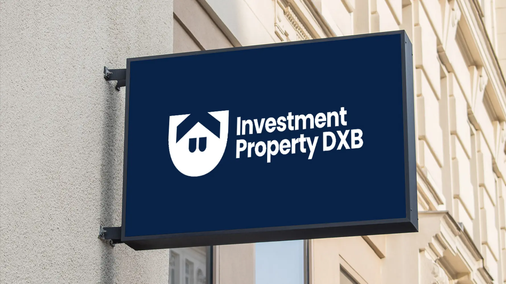
Investment Property DXB asked us to create a logo that shows a strong foundation of real estate investment with trust and professionalism. They required a modern and elegant identity that relates to investors.
Merging Security and Real Estate Elements
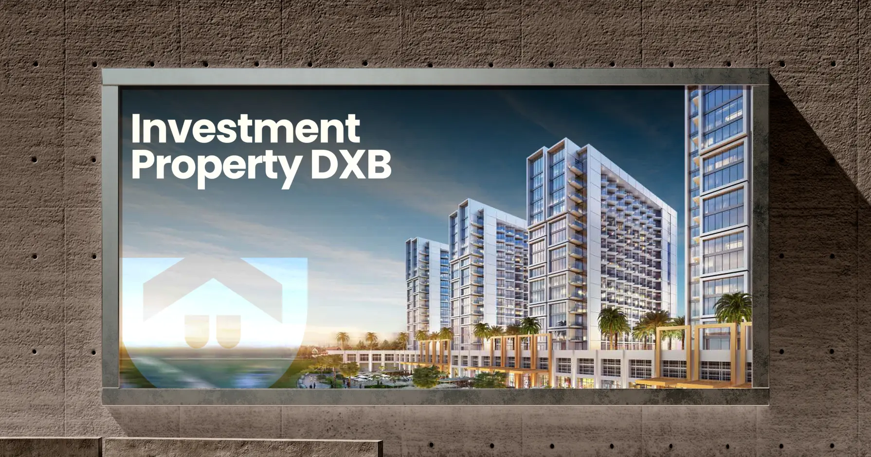
After several consultations with the Investment Property DXB team, we decided to design a shield-like structure representing security and trust with a house icon in it. This icon will not only create the essence of a real estate company but also symbolize financial stability and growth.
Our team of the final design balances strength and elegance, aligning with the company’s mission to provide secure and profitable investment opportunities.
Typeface with a Strong Presence!
Our team of experts chose the professional The Poppins typeface for its clean, modern aesthetics and refined letterforms, mirroring the brand’s solid foundation in real estate. This bold yet sleek design ensures readability and a contemporary feel.
For the color we end up with, deep navy blue (#082247) signifies trust and stability, while white (#FFFFFF) provides contrast, enhancing clarity and sophistication in the overall branding.
Poppins
Aa, Bb, Cc, Dd, Ee, Ff, Gg, Hh, Ii, Jj, Kk, Ll, Mm, Nn, Oo, Pp, Qq, Rr, Ss, Tt, Uu, Vv, Ww, Xx, Yy, Zz
At first, we weren’t sure if they ‘got’ what we were aiming for. But the final logo blew us away. Clean, bold, and memorable. Since launching, we’ve noticed a 50% rise in branded email opens and stronger recall from new clients.